
Remember me


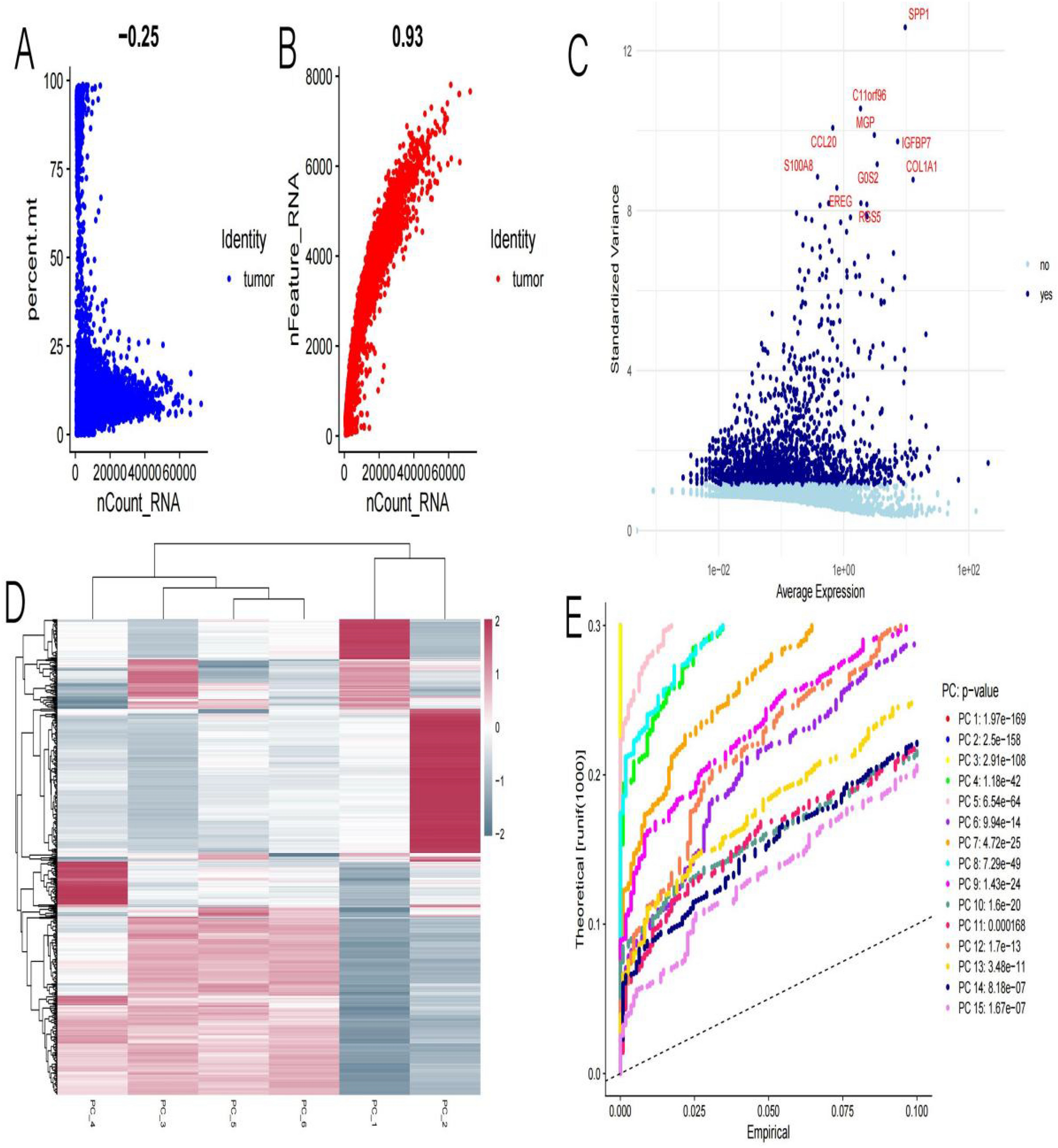
In Fig. 1A shows the negative correlation (-0.25) between the percentage of mitochondrial gene expression (percent.mt) and total RNA count (nCount_RNA). This indicates that as the total RNA count increases, the proportion of mitochondrial gene expression decreases. Blue dots represent tumor samples. Figure 1B displays the positive correlation (0.93) between the number of detected genes (nFeature_RNA) and total RNA count (nCount_RNA). This indicates that as the total RNA count increases, the number of detected genes also increases. Red dots represent tumor samples. Figure 1C: A scatter plot of average expression versus standardized variance, used to identify highly variable genes. Labeled genes (such as SPP1, COL1A1, etc.) may have biological significance in giant cell tumors of bone. Blue and light blue dots represent genes without and with significant variability, respectively. Figure 1D: A heatmap showing the clustering analysis of gene expression across different samples. Colors indicate the levels of gene expression (red for high, blue for low). Hierarchical clustering shows the similarity between samples and genes. Figure 1E displays the results of principal component analysis (PCA), comparing theoretical and empirical distributions. Different colored lines represent different principal components (PC), with p-values indicating the significance of the first few principal components in distinguishing samples.
Fig. 1
The quality control and analysis results of single-cell RNA sequencing data for giant cell tumors of bone. A: Shows a weak negative correlation between RNA counts and mitochondrial gene percentage, indicating cell quality. B: Displays a strong positive correlation between RNA counts and the number of detected genes, suggesting higher quality cells. C: Highlights variable genes, important for identifying different cell states. D: A heatmap showing gene expression patterns, with clusters indicating groups of genes with similar functions. E: PCA plot showing which components capture significant data variation, helping to identify major differences
3.2 Analysis of single-cell RNA sequencing data from giant cell tumors of boneIn Fig. 2A (UMAP plot): The UMAP algorithm is used for dimensionality reduction, showing the clustering of cells. Different colors represent various cell types, such as endothelial cells, macrophages, T cells, NK cells, fibroblasts, cancer-associated fibroblasts, and neuronal cells. The spatial distribution of cell types demonstrates the heterogeneity within the samples. Figure 2B (t-SNE plot): The t-SNE algorithm is used for dimensionality reduction, further illustrating the clustering of cell types. Different colors are used to indicate various cell types. The t-SNE plot provides an alternative perspective for observing similarities and differences between cells. Figure 2C (UMAP plot): A more refined UMAP plot that may more clearly display the distribution of certain cell types. Colors and labels are consistent with Fig. 2A, aiding in identifying the clustering characteristics of specific cell types. Figure 2D (t-SNE plot): A more refined t-SNE plot that may more clearly show the distribution of certain cell types. Similar to Fig. 2B, it uses the same colors and labels to help identify and compare relationships between cell types.
Fig. 2
Analysis of single-cell RNA sequencing data from giant cell tumors of bone. The upper two panels (A and B) show cells colored by age, while the lower two panels (C and D) display cells colored by cell type. The UMAP dimensionality reduction (A and C) demonstrates more compact cellular clustering structures, preserving the global topological relationships of the data, whereas the t-SNE dimensionality reduction (B and D) emphasizes local similarities, making the boundaries between cell subpopulations more distinct. Cell type labeling reveals multiple cell types in the sample, including endothelial cells, macrophages, dendritic cells, T cells, NK cells, fibroblasts, cancer-associated fibroblasts, and neuronal cells. By comparing age distribution and cell type distribution, we can observe enrichment of certain cell types in specific age groups, suggesting that age may be an important factor influencing tissue cellular composition. Although the two dimensionality reduction methods differ in their presentation, both successfully capture the major structural features in the data, effectively demonstrating the cellular heterogeneity of the sample
3.3 Gene expression in different cell types from single-cell RNA sequencing data of giant cell tumors of bone.In Fig. 3A: This is a correlation matrix showing the relationship between different endothelial cell subtypes. Each cell in the matrix represents the correlation coefficient between two cell subtypes, with values ranging from -1 to 1. The color gradient from purple to green indicates the strength and direction of the correlation (purple for negative, green for positive). Crosses mark statistically significant correlations.
Fig. 3
Gene expression in different cell types from single-cell RNA sequencing data of giant cell tumors of bone. A: A correlation heatmap showing the relationships among endothelial cell subtypes. The color gradient indicates the strength of correlation, with purple representing higher correlation. B: A dot plot displaying gene expression across different cell types. Dot size indicates the percentage of cells expressing a gene, while color intensity represents average expression levels. This highlights distinct expression profiles for each cell type
In Fig. 3B: A dot plot illustrating the expression of various features (genes) across different cell identities, including T cells, NK cells, neuronal cells, macrophages, fibroblasts, endothelial cells, dendritic cells, and cancer-associated fibroblasts. The size of each dot represents the percentage of cells expressing a particular gene within that cell type. The color of the dots indicates the average expression level of the gene, with a gradient from purple (low expression) to orange (high expression).
3.4 The differential expression analysis and feature correlation in various cell typesThe analysis reveals distinct gene expression profiles across various cell types in the tumor microenvironment. In Fig. 4A, the volcano plots demonstrate significant differential expression patterns, with endothelial cells exhibiting the most pronounced changes, displaying several highly upregulated genes with statistically significant p-values. Cancer-associated fibroblasts also show notable differential expression, though to a lesser extent than endothelial cells, while immune cells such as T cells and NK cells display moderate gene expression alterations. Figure 4B complements these findings with a comprehensive heatmap visualization, revealing a predominance of upregulated genes (orange/red) across most cell types. Importantly, the heatmap highlights clear distinctions between cancer-associated fibroblasts and normal fibroblasts, suggesting functional specialization within the tumor stroma. The expression patterns also vary significantly among immune cell populations, with each subset (NK cells, T cells, macrophages, and dendritic cells) presenting unique transcriptional signatures. These cell-type-specific differences likely reflect specialized functional roles within the tumor ecosystem and may point to potential therapeutic targets. The dual analytical approach (rFeature_RNA and rCount_RNA) provides methodological robustness to these findings, confirming the transcriptional heterogeneity that characterizes the complex cellular composition of the tumor microenvironment.
Fig. 4
The differential expression analysis and feature correlation in various cell types. A: Volcano plots for each cell type showing differentially expressed genes. The x-axis represents the log fold change, and the y-axis shows the significance level (-log10 adjusted p-value). Points further from the origin indicate significant expression changes. B: A heatmap displaying quality control metrics (e.g., number of features and RNA counts) across different cell types. The color gradient reflects variations in these metrics, helping assess data quality and consistency
3.5 A dot plot illustrating gene expression patterns across different cell typesWe particularly focused on the NA cell cluster, accounting for 5.4% of the sample, which exhibits a unique gene expression profile. Heatmap analysis reveals that the RABAC1 gene not only has the highest average expression level (1.83) in the NA cell cluster but also the highest expression percentage (82.5%), with a differential expression fold change (log2FC) of 2.46 and extremely high statistical significance (p = 1.2e-42). TCF24 and SNAI2 also show significant upregulation, with SNAI2 exhibiting a high fold change of 4.05 despite its relatively lower expression percentage (38.6%), suggesting it may have a specialized function in this cell subpopulation. Additionally, genes such as EIF2AK2, ADAM12, and RGS16 also demonstrate notable upregulation, with expression percentages of 59.8%, 46.2%, and 42.1%, respectively(Fig. 5).
Fig. 5
A dot plot illustrating gene expression patterns across different cell types. Dot size represents the percentage of cells expressing each gene. Larger dots indicate higher expression percentages. Color Intensity reflects average expression levels, with red indicating higher expression. Genes listed along the x-axis, showing variation in expression across the cell types on the y-axis
3.6 The expression levels of specific genes across cells in giant cell tumors of boneEach subplot corresponds to a different gene, such as TMPRSS4, FGF3, KDM6A, etc. The x-axis and y-axis represent the two dimensions of the t-SNE projection, which organizes cells based on gene expression patterns.Color gradient indicates the expression level of each gene. The gradient ranges from light gray (low expression) to dark blue (high expression).Some genes, like TMPRSS4 and TERT, show higher expression in specific clusters, indicating potential roles in those cell populations. The variation in expression patterns across the plots highlights the heterogeneity in gene expression within the tumor microenvironment(Fig. 6).
Fig. 6
The expression levels of specific genes across cells in giant cell tumors of bone. Color Intensity indicates expression levels, with darker purple representing higher expression. Each plot shows how a specific gene is expressed in different cell clusters
3.7 Cell–cell interactions in giant cell tumors of bone, focusing on the SPP1 signaling pathwayIn Fig. 7A displays a network diagram illustrating the number of interactions between different cell types. Nodes represent cell types such as endothelial cells, fibroblasts, and macrophages. Lines connecting nodes indicate interactions, with thicker lines representing a higher number of interactions. Figure 7B:Similar network diagram showing the strength or weight of interactions between cell types. Thicker lines indicate stronger interactions, highlighting key communication pathways. Figure 7C:Two network diagrams focusing on the SPP1 signaling pathway. Arrows indicate the direction of signaling from source to target cell types. The size and color of arrows represent the strength and significance of these signaling interactions. Figure 7D:A heatmap showing the strength of SPP1 signaling interactions between cell types.Rows represent source cell types, and columns represent target cell types. Color intensity indicates the communication probability, with darker green representing stronger interactions.
Fig. 7
Cell–cell interactions in giant cell tumors of bone, focusing on the SPP1 signaling pathway A: Network showing the number of interactions between different cell types. More connections indicate higher interaction frequency. B: Network depicting interaction strength/weights among cell types. Thicker lines represent stronger interactions. C: SPP1 signaling pathway network, highlighting source and target cell interactions. D: Heatmap displaying the contribution of each cell type to the SPP1 signaling network. Darker shades indicate higher contributions
3.8 A comprehensive analysis of pathway enrichment and gene ontology (GO) related to giant cell tumors of boneIn Fig. 8A displays the top pathways enriched in the data set. Pathways such as Parkinson's disease, prion disease, and COVID-19 are highlighted, indicating significant involvement in the dataset. Figure 8B: Similar to Fig. 8A, but uses a dot plot to show enrichment.The x-axis is the enrichment score, while the y-axis lists the pathways. Dot size represents the number of genes involved in each pathway, and color indicates the p-value, with a gradient from purple (higher p-value) to red (lower p-value). Figure 8C: Shows the relationship between genes and enriched pathways. Each line connects a gene to a pathway, with colors representing different pathways. The outer circle lists genes, while the inner segments represent pathways, illustrating complex interactions. Figure 8D: A bar plot presenting GO analysis results across three categories: Biological Process (BP), Cellular Component (CC), and Molecular Function (MF). The x-axis shows the enrichment score, and the y-axis lists GO terms. Different colors correspond to the three GO categories, highlighting diverse biological functions and processes involved.
Fig. 8
A comprehensive analysis of pathway enrichment and gene ontology (GO) related to giant cell tumors of bone. A: Bar chart showing enriched pathways, ranked by enrichment score. Higher scores indicate stronger associations. B: Dot plot of pathways, with dot size representing gene count and color indicating significance (p-value). C: Circular plot illustrating relationships between genes and pathways, showing connectivity and overlap. D: Bar chart of GO terms across three categories (biological process, cellular component, molecular function), with enrichment scores highlighting significant terms
Comments (0)