
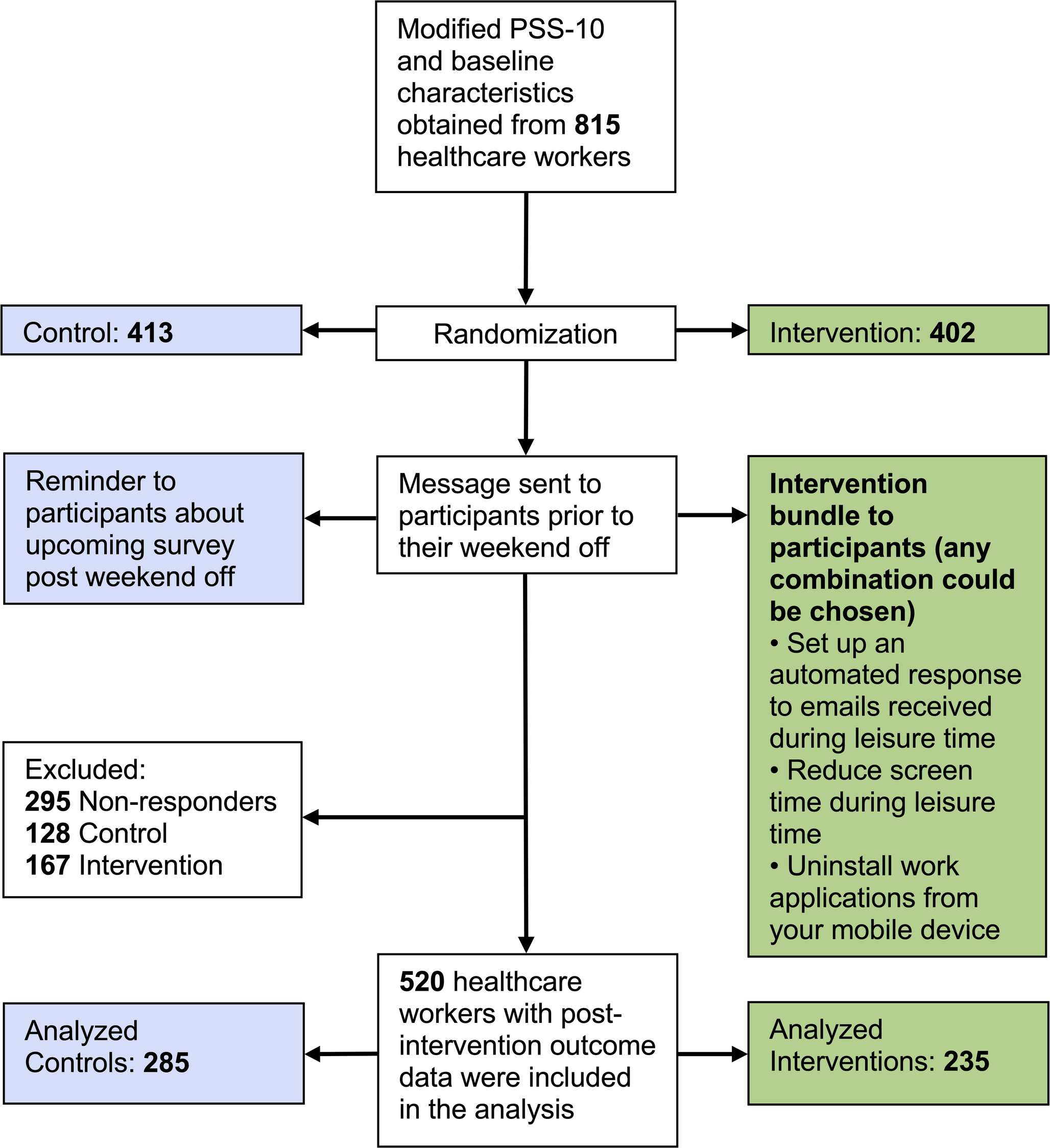
Remember me
In this section, we present the interactive visual tool, which consists of three strategies to display spatial-temporal information (called views): Hospital, Tabular and Epi view (Fig. 1). We explain their implementation and the interactions between them and with the user. See Supplementary File 1 for an example of the interactions and functionalities of the tool.
Hospital ViewThe Hospital view shows pathogen spread, intra-hospital patient transfers, and endemic evolution across services on a 3D hospital plan (Tasks 1-3). This enables analysis of patients’ spatial distribution at each time, infection locations, contact events (when and with whom they shared a room) and areas with high patient concentrations over time.
Fig. 2
Heatmap function. It aggregates the epidemiological indicator by week and service, and shows the values in the tabular view
Patients’ health states, based on the SEIRD-NS model, represent the health transitions regarding a CDI. For quick identification, they are coded with a segmented color scale, following Aigner et al. [24]: green (susceptible), yellow (exposed), red (infected), purple (recovered), black (deceased), and blue (non-susceptible). This helps identify transmissions (ie. when a susceptible patient was in contact with an infected one and became exposed), and potential future cases that could increase the spread.
Users can minimize other views to focus on the hospital and interact with the camera to move, zoom and rotate. To avoid visualization issues like occlusion and perspective distortion common in 3D representations [25], we implemented an orthographic camera, rendering objects uniformly without perspective.
Through a toolbar, users can control patient movements and infection progression animations (forward, backward, pause and resume). They can track patient locations, infection evolution, patients duration in each place, and contacts. Users can also skip time intervals (every 8 hours, day or week), instantly showing patients’ new locations at that moment. Time information (week, day, and morning/afternoon/night) is displayed above these controls. Users can switch floors of the hospital, hide non-essential visual objects (beds or walls), activate patient IDs to identify them, and group the Tabular view information by floor or service. They can enable the HeatMap functionality to see weekly-aggregated epidemiological indicators and track the evolution of each service (Fig. 2). This is useful for viewing in a controlled manner, summarized information on the status of each service (eg., to easily identify services where a given epidemiological threshold (eg. prevalence) is surpassed, locate extreme values, or compare the incidence rate between different wards).
Tabular ViewThe Tabular view aids infection analysis by showing epidemiological indicators by place and time (Tasks 1, 2). Users can choose the indicator at different spatial scales: hospital, floor or service level. For by-service, services are color-coded and coordinated with the Hospital view for easy map localization (Fig. 3). Clicking a service pans the Hospital view to that location. With HeatMap activated, this view displays a color legend and weekly aggregated indicator values by service (Fig. 2).
Fig. 3
Epidemiological indicator aggregated by service. Both Hospital and Tabular views are color-coordinated so that each service is easily located
Fig. 4
Epi view and filter menu performing semantic zooming. The user can choose a smaller range of time, and this will change the line chart temporal dimension
Epi ViewThe Epi view shows the temporal progression of epidemiological indicators through line charts, allowing analysis of infection evolution (Tasks 1, 4). Users can select an indicator: daily cases and point prevalence, or weekly incidence, period prevalence, mortality rate and incidence density. Daily cases follow the SEIRD-NS model, with health states color-coded to match the Hospital view. This provides an overview of the study period, with options for semantic and graphical zooming (Fig. 4), hovering over charts for specific values and filtering out information (Fig. 1C).
Filter of PatientsBesides the view-specific interactions, users can filter patients by age range, gender and health state in all views [26]. They can also zoom, as defined by Shneiderman [26], to focus on a subset of patients, selecting a time range, which automatically updates the other views accordingly (Fig. 4).
Evaluation ResultsIn this section, we explain the results of the evaluation regarding usability, interpretability and utility.
Participants and Data CollectionThe study involved 14 health professionals (7 women, 7 men) from J. M. Morales Meseguer General University Hospital, Murcia, Spain. Participants ranged in age from 26 to 60, with different years of experience (Table 2). Data collected included responses to CDI scenario tasks, completion times, collaborators’ notes, PSSUQ questionnaire results, and participant feedback.
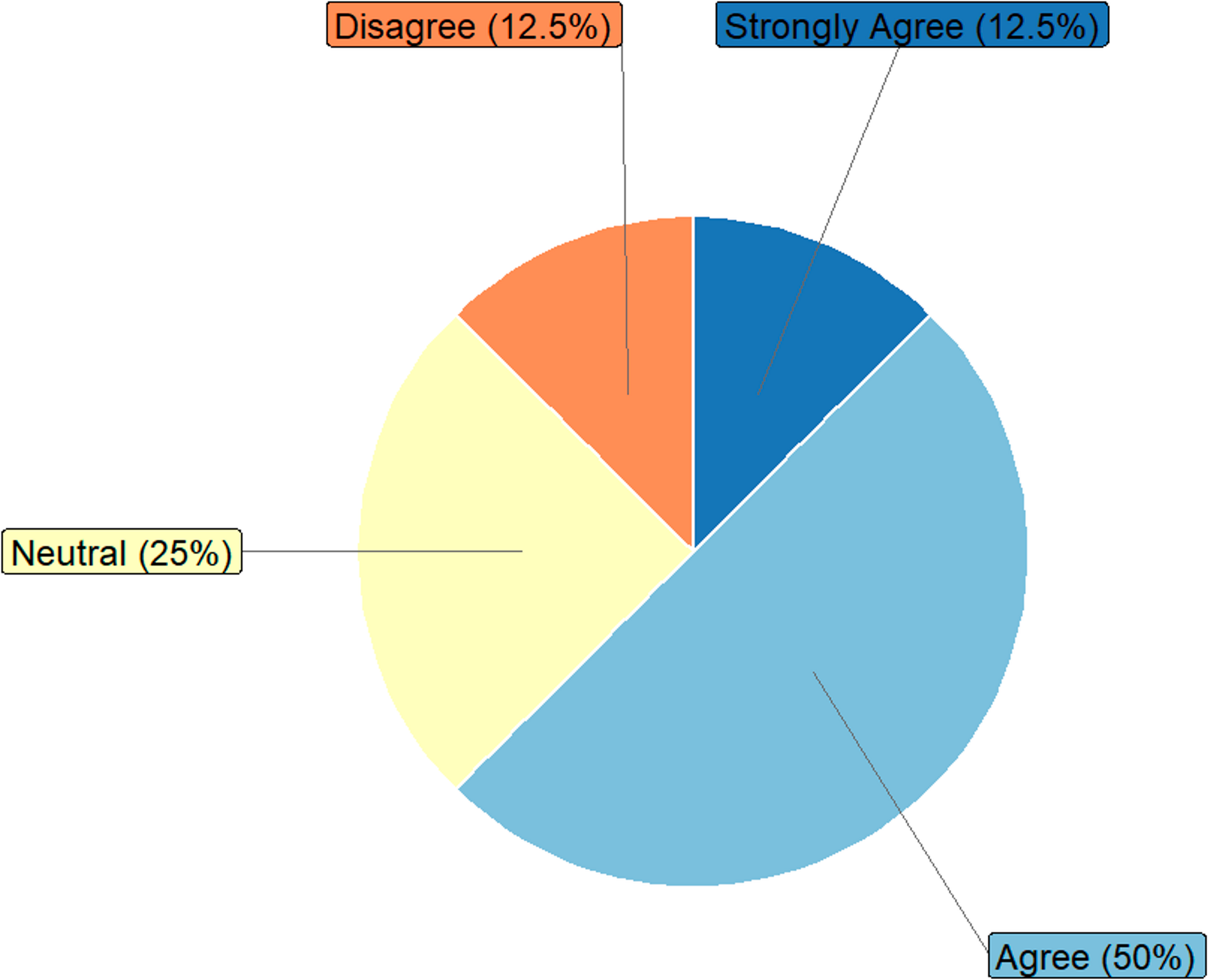
Usability EvaluationThe usability evaluation assessed the tool’s effectiveness, user satisfaction, and ease of use using the PSSUQ. The average response for system usefulness (Q1-Q8) was 1.79 (1 means “totally agree”), indicating high satisfaction (Fig. 5).
Table 2 Summary of participants in the evaluationFig. 5
PSSUQ results of OBViz. Q1-Q8 refer to usability, Q9-Q14 refer to quality of information and Q15-Q18 refer to quality of interface
Participants found the tool easy to use, especially for detecting patient contacts: the ability to see the entire hospital and individual patients to detect contacts was a significant improvement over manual analysis. They also found it intuitive, clear, and quick to learn, with an average response of 1.92 for information quality (Q9-Q14).
Several participants mentioned the interface was pleasant, particularly appreciating the color-coded services for quick location and identification of contaminated beds. For interface quality (Q15-Q18), the average was 1.85. However, some participants noted that patient monitoring was not very intuitive and suggested improvements (see Section 3.2.5).
Interpretability EvaluationInterpretability measures how well the tool explains actions and events in a hospital setting. We evaluated its performance in solving clinical tasks (see Section 2.2) by translating them into 10 daily problems for infection specialists (Appendix C).
Figure 6 shows the percentage of correct answers per question, connected to the user task they address. Men had an 88.57% correct rate and women had a 94.29%, with no significant age difference. The lowest score (57.14%) was for patient contact (Q8, Task 3), consistent with participants’ comments on the difficulty of tracking patients.
In question Q9, regarding counting outbreaks (85.72% correct rate), the main challenge was understanding our definition of an outbreak. However, participants who regularly studied hospital outbreaks performed better than those less familiar with the task.
On average, users took 16.36 minutes to complete the questionnaire, with an average success rate of 91.43%.
Fig. 6
Interpretability results. Success rate of multiple choice questions in the evaluation. Questions (1-10) are categorized by the user tasks to which they belong (Task 1-Task 4)
Table 3 Improvements requestedUtility EvaluationUtility reflects the interviewee’s perception of the tool’s potential to solve daily tasks.
After testing the tool, we conducted informal interviews to gather opinions, guiding the conversation with pre-established questions when necessary. Ten participants found it useful, and seven indicated they would incorporate it into their workflow. Two saw more utility within the ICU for patient monitoring, while another two expressed interest for annual infection and outbreak studies. Five noted its potential for studying other pathogens (eg., seasonal flu, respiratory viruses).
Suggestions for ImprovementsDuring feedback, we asked for suggestions to enhance the tool’s utility. Table 3 shows the most repeated improvements requested.
Comments (0)