
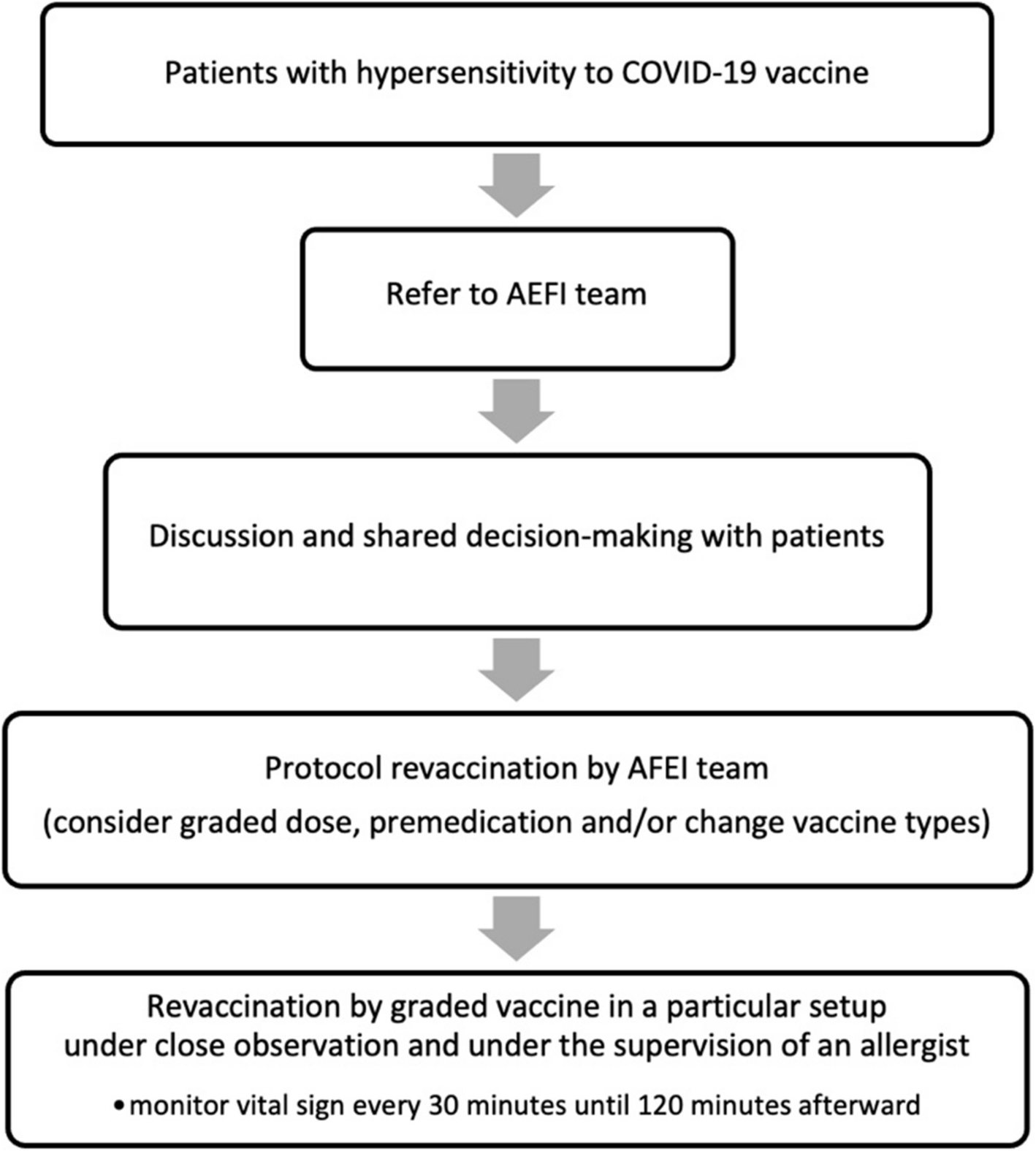
Remember me


The study used two datasets, the first of which had 2,100 chest X-ray pictures to serve as training purpose and 910 as testing purpose. Employing the NearKbest interpolation method, the photos were resized to a standard size of 225*225*3. DenseNet-16, a model framework with 20,311,999 parameters, was selected. We required 40 epochs were required for the model's training under the Anaconda Python environment. We use Batch Normalization following few layers to improve the performance of deep learning system. We used another NSBI dataset from Genbank for the purpose of this study, which contains genomic data for COVID 19 in FASTA format from different nations. We used the COVID 19 genome dataset from two separate countries. This keeps everything steady as you practice. The Adam optimizer, that is effective at determining the optimal parameters for simulation, that instructed to be used while configuring the model. This model learns more quickly and performs better because to this combination.
We calculated the genome sequences'overall computation time in 1.83 s and calculated the proportion of altered genome sequences at 1.31% (see Tables 2 and 3). Out of all genome sequences, COVID-19 was accurately categorized by computation time. The changing percentage represents the percentage of modified genomic sequences during COVID-19.
Table 2 Calculate computation time of genome sequenceTable 3 Percentage of genome sequenceThe information from the DataFrame sequence''sequence ratios'column will be used to generate a bar graph. Sequence Ratio is written on the plot's y-axis as its label and"Index/Sequence numbering where genomes are missing"is representing by the x-axis label of the plot as shown in Fig. 3. The bar design can pinpoint certain indices or sequence numbers where genomes are absent. There may be clusters, voids, or patterns in the missing data that may be seen by visually examining the plot. This knowledge might be very helpful in comprehending the causes of missing genomes and perhaps direct additional research. The distribution pattern of sequencing proportions smaller than one may be shown and examined using the code, which is helpful overall. In addition, it facilitates data comparison, pattern identification, and communication. These details might be helpful in various sectors, including genetics, data analysis, research, and bioinformatics, wherever it's crucial to comprehend the sequence ratio's distribution.
Fig. 3
Missing index of genome sequence
The nucleotide percentages in the genome sequence (A, G, T, and C) are calculated using the code. The genome's makeup may be understood using this information, which is also useful for understanding the structural and functional characteristics of the genome. This programme also determines the GC content, representing 37.86% of the genome sequence's Guanine (G) followed by Cytosine (C) bases. GC concentration is a crucial metric in genomics because it can affect evolutionary trends, protein-coding competence, and DNA steadiness. That is utilized in a gene forecast, variety of genomic research, phylogenetic learning, and primer design.
The provided algorithm compares sequences of genes from the USA versus China to analyze them. A set of the names of genes is iterated over and over as several procedures are carried out for each gene. The genetic sequence is translated from DNA into RNA, transformed into a numpy array, and then plotted. The next step involves:
The function outputs the finished protein sequence once the mRNA sequence is translated. Overall, it makes gene mutation analysis easier and sheds light on the genetic variances from the USA to China.
The proposed technique emphasizes the translation of protein and mRNA analyses. It uses a specific translation table to translate an mRNA to an amino acid sequence. The length and the outcome of the amino acid sequence are printed. The model also prints the original mRNA sequence's length. Finally, it offers details on the typical RNA codon table. This code may be used to investigate protein production, comprehend how the genetic code is translated and examine sequences of proteins as shown in Fig. 4.
Fig. 4
Mutation of genome sequence
The number of distinct amino acids found in the sequence of proteins, some of which are present on more occasions than others, has been shown by counting everyone. The proportion of every amino acid in the protein's sequence provides a normalized representation, illuminating the similarities and differences between amino acids. Understanding the general amino acid distribution of the protein and spotting any biases or trends may be done using this information.
The protein's molecular weight indicates its dimensions and level of complexity. When comparing proteins or forecasting their physical characteristics, it indicates the total separate weight of every amino acid in the sequence. The aromaticity value (see Table 4) indicates the amount of aromatic amino acids in the protein sequence, including tryptophan, tyrosine, and phenylalanine. The presence of certain aromatic amino acids may have an impact on the protein's interactions, function, or structure if the aromaticity score is higher.
Table 4 Aromaticity and molecular mass of genome sequenceThe GenoDense model creates a visualization showing the distribution or composition of a certain information collection in Fig. 5. In this instance, the proposed model precisely depicts the protein amino acid structure of the POI (Protein of Interest). The corresponding presence or quantity of each amino acid in the POI has been intuitively and easily visualized using a graph to illustrating the data. These may be helpful in different biochemical and biological investigations and can aid in understanding the qualities and traits of the protein.
Fig. 5
Interest of proteins of genome sequence
The provided data also creates a graph which is showing the protein length variation. Our understanding of the distribution and frequency of various protein lengths in the data set is made possible through the proposed method's ability to visualize protein lengths. This Fig. 6 is a graph that visually depicts the protein length's distribution by displaying the protein's number concentrated and a range of lengths in each length bin. This information might be helpful for analysis and evaluation of the acquired understanding of the protein data under review and the spot patterns.
Fig. 6
Length of proteins of genome sequence
To visualize, the residual length of range using a Fig. 7, the accompanying figure excludes the highest and lowest values or outliers from the protein's length data. The"functional_proteins"dataset is filtered by the algorithm, which only chooses proteins with lengths under 60. A new data frame contains these filtered proteins.
Fig. 7
Length of proteins of genome sequence where threshold value < 60
The protein length's distribution less than 60 kDa has displayed by plotting the graph employing the filtering protein's lengths. The visualization aids in understanding the protein's frequency or concentration together with shortened lengths and the overall distribution of protein lengths within a certain range. Insights into the lengths of common or normal proteins of the dataset may be gained by performing a targeted analysis of the protein length distribution free from the impact of extreme values.
The"functional_proteins"dataset is filtered using the provided code to only include proteins with a length larger than 1000 kDa. A new data frame contains the proteins that have been filtered. The method then creates a histogram displaying the distribution of proteins with lengths larger than 1000, employing the processed proteins'total lengths. The distribution of greater lengths of protein throughout the data set is shown visually by the Fig. 8.
Fig. 8
Length of proteins where threshold value > 1000
By examining the visualization, one can gain understanding about the concentration and frequency of proteins of longer chains, which can help one comprehend the structure of the huge proteins inside the data set. The visualization aids in the discovery of any patterns or traits connected to proteins with lengths greater than the predetermined threshold of 1000.
Pairwise sequencing of the connections between various DNA sequences is done using the suggested technique. It determines the alignment scores between the sequences. It divides each by the total length of the sequence used as a reference to get similarities scoring between the sequences and turns those into percentages.
Then, three comparisons— MERS/SARS, MERS/COV2, and SARS/COV2 —has been presented with the computed similarity percentages. The pattern of similarities between various viruses, has presented in the Fig. 9, is shed light on by these comparisons. In contrast to the Y-axis which shows the proportion of sequence identity, the X-axis displays various sequence comparisons. Figure 9 makes it easy to compare the sequence resemblances of the various DNA sequences. To analyse DNA sequences, the technique combines pairwise sequence position, visualizing DNA sequences, and computing relevance scores.
Fig. 9
Sequence identity in percentage of genome sequence
A multi-layered neural network structure is depicted in the Fig. 10. The Dense layer, a Dropout layer, and the LSTM layer are all parts of the model architecture. According to the LSTM layer's output structure (None, 61, 16), it accepts sequences of inputs of length 61 and generates sequences of output of length 16. There are 5632 parameters in the LSTM layer.
Fig. 10
Multi-layered neural network structures
The output shape is unaffected by the Dropout layer, which operates for regularisation and to avoid overfitting. Since it doesn't add additional weights to the structure, it has no parameters. The output shape of the Dense layer, which comes after the Dropout layer, is (None, 61, 16). The supplied data is transformed using the 272 parameters that are introduced. A second Dropout layer is added without altering the output form. The model is finished using a Dense layer with the output form (None, 61, 6). The 102 parameters have been used for this layer. The model comprises 6,006 distinct parameters in total, every one of that is trainable. The parameters that can be trained are modified to enhance the performance of the model (see Table 5). These non-trainable parameters of model are set to 0. The design of the model, the variable’s count for every layer, along with the form of the result at each level are all described in this overview. It aids in comprehending the neural network model's intricacy and capabilities. Adam, the optimizer, is configured by the code with particular weight decay and learning rate. During training, the optimize is in charge of adjusting the neural network's weights. Categorical cross-entropy, a popular loss function for multi-class classification issues, was selected as the loss function.
Table 5 The CNN model’s performance comparisonEvery training development of each epoch in the training and validation of model is valuable. The information is broken out as follows; Epoch: When training for this particular epoch, the loss function's value is called the loss. It displays the model's performance and shows how closely the predictions match the actual numbers, and Accuracy: The model's accuracy for the training data set represents up to this present epoch. It displays the percentage of accurately predicted samples. Several of the test models (VGG-19, ResNet-50, AlexNet, and VGG-16) were developed applying transfer learning techniques with previously trained ImageNet parameters in order to guarantee an even evaluation. Binary classification was used for the last fully connected layers. The training setup (batch size = 32, learning rate = 0.001), number of epochs (40), and data preparation were identical for every model. The Google Colaboratory with GPU support (identical hardware environment) was used for the training. A comparison of training efficiency, model complexity, and performance is shown in Table 5. In particular, we used pairwise t-tests (with Bonferroni correction) after a one-way ANOVA test to assess the significance of the performance differences between the previous models and GenoDense-Net. Accuracy scores gathered from five separate runs of each model utilizing identical train-test splits have been used for the tests. The ANOVA findings verified that the mean accuracy of the models varied statistically significantly (p < 0.01). Furthermore, GenoDense-Net's improvements over all other models are statistically significant, according to the t-tests (p < 0.05 after correction) (see Table 6).
Table 6 The CNN model’s statistical comparisonAdditionally, we have emphasized the special contribution of GenoDense-Net, a hybrid model that combines an image-inspired DenseNet structure with genome-wide coding to enable high accuracy (99.18%) with the classification of infectious diseases from DNA sequences while preserving computational clarity. This comparison makes our work's positioning stronger (see Table 7) and makes clear how original it is compared to probabilistic and transformer-based sequence models. The model’s complexity comparison is presented in Table 8.
Table 7 GenoDense-Net compared to the most advanced genomic models of AITable 8 The CNN Model’s complexity comparisonA standard bar plot is depicted in Fig. 11, where each bar's length indicates how important a particular feature is. The'Features'axis in this figure would stand for image features (such as certain patterns or areas in the X-ray pictures), and the'significance'axis represents the relative contribution of each feature to the prediction of the model.
Fig. 11
Figure 12 shows the genetic differences between different strains of COVID-19. These many strains are listed on a vertical axis in the picture, while particular genes or areas of the viral genome are indicated on a horizontal axis. Each strain is given a unique hue in the depiction, making it simple to compare their genetic variations and giving a clear picture of the strains'genomic diversity.
Fig. 12
Genetic variations among strains
Comments (0)