
Remember me


Most longitudinal, idiographic network research to date has used vector autoregressive (VAR) models [13]. Despite various strengths, these traditional models need many assessments (intensive time-series data) and rely on several assumptions including linearity of associations and fixed time intervals between successive assessments (Haslbeck et al., 2021). This means the analysis assumes that symptom scores at one time point remain stable over time, so past scores from a patient in therapy are equally informative for future scores. Furthermore, if changes in symptoms occur over longer periods or abrupt, they cannot always be recognized as being associated within these traditional models [34]. This could lead to difficulties when working with data from clinical practice, which are rarely intensive times series data, and many of the assumptions are difficult to be met. For example, we expect change to happen in therapy and for some patients such changes may happen suddenly. The method for analysis needs to be able to handle these sudden changes.
DTW is a good alternative as it uses a non-linear, shape-based approach. This means that the shape-based algorithm compares the overall form or trajectory of two time series (of symptoms) rather than matching them strictly point-by-point in time, which might obscure meaningful symptom change across therapy. The shape-based algorithm uses ‘Elastic’ distance measures [4, 18], which does not assume linearity. An elastic distance measure allows flexibility in matching: one point in one series can align with several points in the other, or the matching can “stretch” and “compress” in time. In psychotherapy research, this means that if two patients with eating disorders work on their fear of eating—one showing much less restraint in week 2 and the other in week 6—DTW can recognize that their underlying processes are similar, even though the changes occur at different times. The key point is that “less fear of eating,” is associated with less “restraint”. DTW captures this by using a shape-based approach and an elastic, flexible algorithm. In the following, we will outline how DTW works by presenting the steps in DTW, from investigating a single item pair, aggregating individual data, making undirected and directed networks both at an individual level and group level. In this tutorial we will use data from a real-world setting with items from the Eating Disorder Questionnaire (EDE-Q). Each node in the network represents one item. Because many EDE-Q items in the network are symptoms (but not always), we use the terms ‘items’ and ‘symptoms’ interchangeably when describing the nodes.
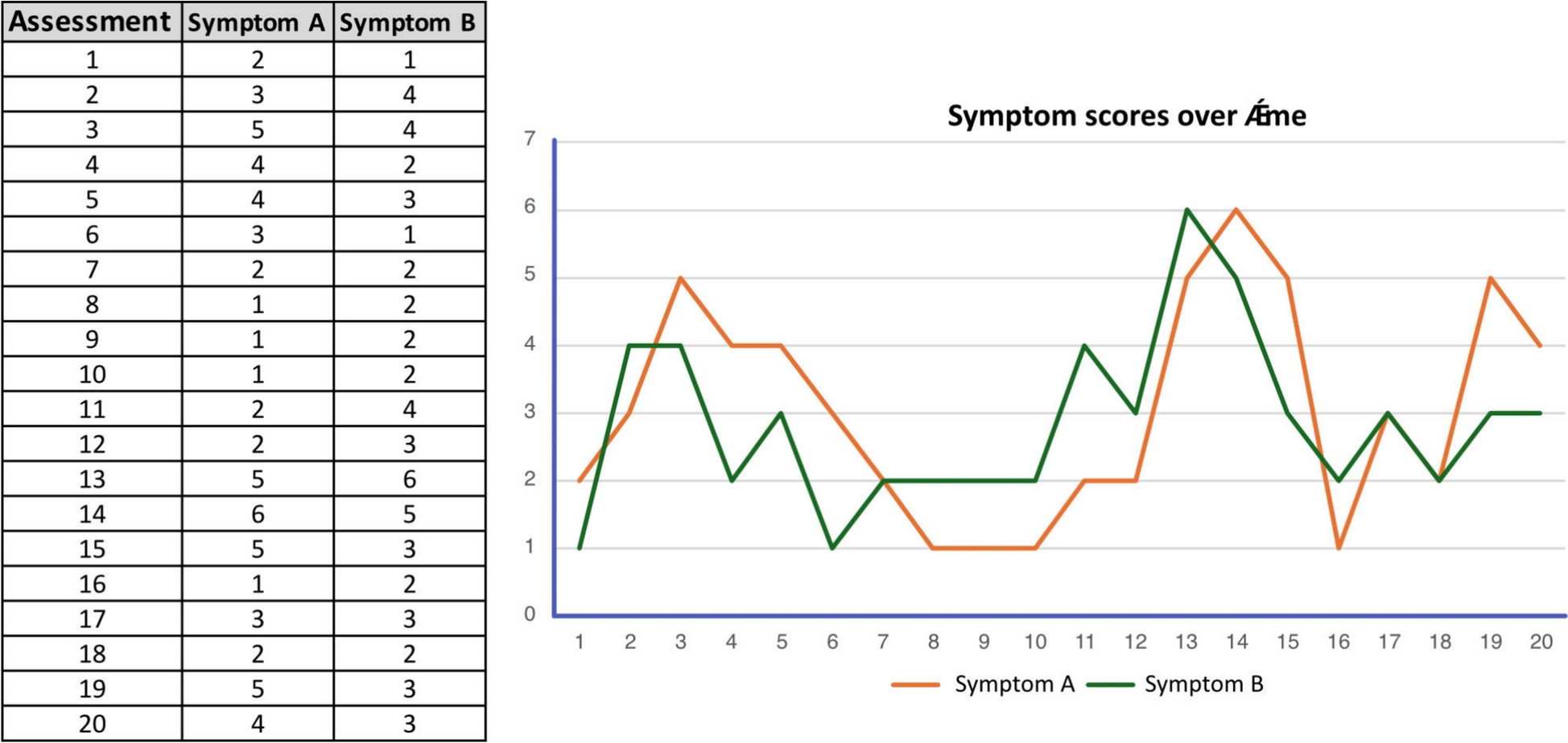
How undirected DTW works—for a single item pair over timeSymptoms can be repeatedly measured within a person over time. Each point represents an assessment of where the intensity of the symptoms is recorded. By tracking these symptoms across multiple time points, we can examine whether they tend to rise and fall together, suggesting a potential relationship, or whether they fluctuate independently. This type of within-person temporal data allows for detailed analysis of how symptoms co-occur or diverge over time, offering valuable insights into individual symptom dynamics. DTW can be helpful in this context, as it calculates the distance for each pair of symptoms (between each symptom and all the other symptoms) in the model across several time points (with panel data or within a more extensive time series) [6]. In Fig. 1 examples of such time series are presented, showing the scores of two symptoms (Symptom A: ‘restraint’, and Symptom B: ‘fear of eating’) across 20 time points.
Fig. 1
Symptom scores over time. The chart and graph show how Symptom A (e.g., restraint) and Symptom B (e.g., fear of eating) change across assessment time points
How undirected DTW works—for a set of items over timeAn undirected network is a network of how several symptoms change together across time. Often such comparisons are made point by point. In other words, symptom scores at time point 1 in Symptom A are compared only with time point 1 in Symptom B, assuming perfect time alignment. This is called Euclidean distance measure. While calculating the Euclidean distance is straightforward, it can be misleading if similar symptom patterns occur at slightly different time points.
However, as two symptoms will not always change at the same pace, DTW looks for the best alignment between the two time series. It allows for more flexibility in how the time series are aligned. Instead of enforcing a strict point-by-point comparison, DTW enables non-linear stretching and compression along the time axis. As previously mentioned, this means that changes in one symptom can be aligned with similar changes in the other symptom, even if they occur a few timepoints earlier or later. Figure 2 illustrates the difference between Euclidean distance and DTW distance when comparing the temporal patterns of two symptoms across time. In the top panel, the Euclidean distance is shown. The vertical dashed lines highlight how even small shifts in timing can result in large perceived distances, despite the overall shape of the patterns being quite similar. The dashed lines in the bottom panel demonstrate how DTW finds the most meaningful alignment between the two patterns, despite differences in timing.
Fig. 2
Euclidean distance and DTW distance. Comparison of symptom time series using two methods. Top panel: direct, point-by-point comparison using Euclidean distance. Bottom panel: non-linear comparison using Dynamic Time Warping (DTW), which allows local “stretching” of the time axis. The R code for both methods is provided below the heading for tutorial purposes
Other methods for network analysis typically rely on mean scores across time points. In contrast, DTW operates directly on raw scores, preserving the original variability in symptom dynamics. However, using raw scores introduces the challenge of comparing data across different questionnaires with varying scoring systems. Sometimes, nodes in the network represent sum scores with a completely different range than nodes based on mean values or single-item scores. To address this, DTW applies scaled data during analysis, standardizing scores to enable meaningful comparisons across measures (see Fig. 3; [29]). When scores represent very rare occurrences in the dataset, such as symptoms like depersonalization or suicidal ideation, scaled scores can result in extreme values. In these cases, it may be advisable to cap scores at plus or minus 3 standard deviations.
Fig. 3
Original and scaled data in DTW. Table and graph showing the difference between raw scores and scaled scores in three different eating disorder items (symptom dimensions)
Data can be scaled by using the ‘scale()’ function in R, which centers each variable around its mean and dividing by its standard deviation to ensure comparability across measures.
Aggregating individual data to generate an undirected group-level networkUndirected DTW can be used to compare each person’s symptom patterns with those of others, identifying similarities in how symptoms change over time. Importantly, DTW does not assume that one person is “ahead” or “behind” another; instead, it flexibly aligns symptom trajectories, regardless of differences in timing. This makes it possible to detect subgroups of patients with similar patterns of change, even when those patterns unfold at different speeds or times.
DTW relies on a dynamic programming approach that stretches and compresses time series to minimize a predefined distance measure [2, 15, 18]. For each pair of time series, DTW constructs a cost matrix, where each cell represents the local cost of aligning one observation from the first series with one observation from the second. The algorithm then searches this matrix for the optimal warping path- the sequence of alignments that minimizes the cumulative distance while allowing for temporal stretching or compression. The resulting DTW distance summarizes the overall similarity between the two sequences after optimal alignment, and these distances can then be averaged across patients.
In this tutorial we report the results from a previous article; Kopland and colleagues (2024). In this study, the distance matrix contains n*(n−1)/2) distinct distances per patient (i.e., (28*27)/2 = 378 in our example, due to 28 questions in the EDE-Q), which, in the total group led to 122 * 378 = 46,872 calculated DTW distances (as N = 122 in our study). In simple terms, the cost matrix shows every point-to-point comparison between two time series (e.g., restraint vs. fear of eating), while the distance matrix summarizes the overall similarity between entire symptoms and their relations to all other symptoms in the network (see Fig. 4).
Fig. 4
Cost matrix in DTW. illustrates this process. Panel A shows two symptom trajectories over time and their DTW distance. Panel B provides the R script used to calculate the DTW distance. Panels C and D display the optimal alignment between two symptoms using a heatmap and a 3D plot. Panel E presents the cost matrix, representing the cumulative distance between two symptoms across all patients. Finally, Panel F outlines the mathematical definition of a single cell in the cost matrix
The distance matrix was subsequently analyzed using hierarchical cluster analysis to identify groups of symptoms with similar change profiles. The optimal number of clusters was determined using the elbow method, based on explained variance as a function of the number of clusters (hierarchical Ward.D2 clustering). This analysis identified three symptom clusters, which were color-coded consistently throughout all figures.
Before DTW analysis, all EDE-Q items were standardized at the group level to ensure that distances reflected change dynamics over time rather than differences in symptom scale. Only significant edges are displayed in the resulting undirected DTW network. In this network, smaller distances between two symptoms indicate that they tend to co-occur more similarly over time. The network was generated using the qgraph R package [12]. Figure 5 shows the undirected symptom network for 122 patients across therapy. To aid replication, we also provide an example R script with simulated data from nine patients across ten measurements (see Supplement 1 and https://osf.io/fx8y5).
Fig. 5
Undirected DTW network of 122 patients with eating disorders. A. Showing an undirected network of how symptom clusters change similarly over time. The three colors represent clusters of symptoms with similar change profiles: blue indicates eating disorder behaviors, yellow reflects eating disorder–related inhibition, and red represents eating disorder–related cognitions and feelings. B. Showing the centrality of each item of the EDE-Q. Overvaluation of shape and weight being the most central items. The figure is retrieved from [22] (doi: https://doi.org/10.1002/eat.24097) with the general permission of Wiley
In the network, edges (i.e., links between nodes) represent significant relationships (p < 0.05) based on the shortest distances between symptoms, adjusted for each patient’s average item scores over time. This adjustment helps to avoid spurious edges that might otherwise arise from symptoms that are generally rated at similar levels across assessments. The thickness of edges indicates the strength of similarity in change patterns, while the size of each node reflects its connectivity to other nodes.
Finally, the standardized centrality of each of the 28 EDE-Q symptoms was calculated and presented in a bar graph. Symptoms with high centrality are more influential in the network, as they are strongly connected to many other symptoms. Such central symptoms are often considered valuable therapeutic targets, since changing them may influence other symptoms and thereby support recovery. In our network [22], three dimensions of change similarities were identified: eating disorder inhibition (yellow), eating disorder cognitions and feelings (red) and lastly, eating disorder behavior (blue). Overvaluation of shape and weight showed the highest centrality and out-strength. This suggests that addressing thoughts and feelings about shape and weight could affect multiple other symptom clusters, potentially “dissolving” the broader symptom network of eating disorders. For more thorough discussion on the clinical implications of this study, please consult [22].
How directed DTW works—for a single item pair over timeDirected DTW estimates temporal lag patterns among nodes. In the context of therapy data, this approach can indicate which symptom changes are more likely to precede changes in other symptoms, thereby highlighting potential targets for intervention. One of the key conditions for causality is the presence of a temporal relationship, where the causal factor must occur before the consequence. Although directed DTW is based on observational data, it can bring us closer to understanding how change in one symptom may influence or lead to change in another. Figure 6 shows time-series data for three items (A, B, and C) across 40 measurements, along with the resulting undirected and directed DTW illustrations. The green line (Item C) follows a different pattern compared to the blue (Item A) and red (Item B) lines, fluctuating independently. In contrast, Items A and B show a more similar dynamic over time, moving roughly together in their ups and downs. As a result, in the undirected DTW network, an edge is drawn between Item A and Item B, indicating their similarity, while Item C remains disconnected. In the directed DTW network, the analysis also considers the temporal ordering of changes: it is observed that changes in Item A tend to precede similar changes in Item B. Therefore, a directed edge (arrow) is drawn from Item A to Item B, suggesting that dynamics in A precedes and those of the dynamics in B, while Item C again remains isolated. In the directed DTW network, temporal precedence yields a directed edge from A to B. Temporal precedence means that one event or change occurs before another, establishing the correct time order between variables (e.g., in therapy data, a reduction in fear of eating must occur before a reduction in restraint for the former to be considered a possible driver of change).
Fig. 6
Undirected and directed DTW of symptom change. Time-series data for three items A, B, C across 40 measurements and the resulting DTW networks. Items A (blue) and B (red) show similar dynamics, leading to an edge between them, while Item C (green) remains isolated. Because changes in Item A (blue) frequently precede similar changes in Item B (red), the directed DTW analysis identifies a directional relationship, represented by an arrow from A to B in the directed DTW network
Figure 7 builds on Fig. 6 by focusing only on the blue and red item scores (Item A and Item B), showing their point-by-point DTW alignments between the two time series. The analysis here uses a directed warping path, which only looks forward in time, comparing the relationship between Item A and Item B at lag 0 (the same time point) and lag 1 (one time point ahead). Many of the arrows point slightly forward in time, meaning that the best match between a value of Item A and a value of Item B often occurs shortly after, rather than exactly at the same time. This suggests that the distance to the "next" time point is mathematically shorter (i.e., a better match) than the distance at the current time point, which supports the idea that changes in Item A slightly precede changes in Item B. This directional alignment therefore provides information about the degree of potential lead-lag relationships between the two items. A clinical example is that directed DTW can detect patterns of e.g. a reduction of ‘fear of eating’ (Item A) precedes a decrease in ‘restraint’ (Item B), thereby indicating temporal precedence. Issues of temporal precedence and model specification (bivariate vs. multivariate) will be addressed in the Discussion section.
Fig. 7
DTW warping of item scores across therapy Item scores over time with DTW warping. The point-by-point DTW alignments are shown as arrows between Item A (blue, ‘fear of eating’) and Item B (red, ‘restraint’)
As noted for the undirected DTW analysis, a ‘cost matrix’ underlies the point-by-point alignment of two time series. It is used to compare the similarity between two symptom time series, which essentially map how one pattern of change can be aligned with another over time (see Fig. 4). You can think of the cost matrix as a grid where each cell represents the 'cost' or difference between symptom scores at two time points, one from each series. DTW then finds the optimal path through this grid that minimizes the total cost, effectively identifying how the patterns align, even if one person’s symptoms change faster or slower than another’s.
In contrast to the undirected DTW analysis, we now aim to explain the cost matrix that underlies the directed (temporal) DTW analysis. This was done using a revised Sakoe-Chiba window band [30], which is a part of the DTW algorithm that constrains the window “searching” for optimal alignment. The Sakoe-Chiba was specified as being asymmetric. This means that the dynamic alignment was constrained to a single direction (i.e., only toward later time points) to examine directionality (see Fig. 8). The Sakoe-Chiba also narrows the warping path to a band around the diagonal of the matrix, preventing excessive matching to time points very far away, as well as making the computation more efficient and accurate [30]. In Fig. 8, the optimal alignment path from Item A to Item B is shown as the red route, within this asymmetric window. The final directed distances between the two items A and B are calculated at the bottom. So, we use both distances, from Item A to Item B (as shown in Fig. 6 and 7) and the distance from Item B to Item A that was much longer (i.e., 25.1 versus 11.9). The relative difference in distance is calculated and highlights how temporal directionality between the symptom pair can be quantified.
Fig. 8
Cost matrix of two items with warping curve alignment. Cost matrix between Item A and Item B. The red line shows the optimal warping curve computed using dynamic time warping (DTW). Each cell in the cost matrix corresponds to the local cost of aligning a point in Item A (y-axis) with a point in Item B (x-axis). The warping path is determined by selecting the sequence of cells (shown in red) that minimizes the cumulative alignment cost from the lower-left to the upper-right corner of the matrix. Because an asymmetric window is applied, the warping path is constrained along the diagonal but only allows forward progression in time. This means that each point in Item A can only be aligned with current or future points in Item B, ensuring a temporal alignment. In other words, the alignment avoids "backward" matches, which yields a directional relationship between the two time series. The final cumulative cost at the end of the warping path (i.e., 11.9) represents the DTW distance from Item A to Item B. This value, combined with the reverse distance (from Item B to Item A, being 25.1), allows for the calculation of the directed distance, which quantifies that time serie A systematically preceded changes in time serie B with a strength of 0.36
How directed DTW works—for a group of individualsFor the tutorial on directed DTW, we again present the results from Kopland and colleagues [22]. Similarly, we conducted directed group-level DTW analyses. For each of the 122 patients, a directed distance matrix was estimated. Thus, for each person we first analyze every possible symptom pair to see if one symptom tends to change before the other. This produces a distance matrix for that individual. We then combine these individual networks from all participants into a single aggregated group-level network by averaging the results and testing which connections are statistically significant. Only the connections that pass this test are shown as arrows in the final network, indicating the direction from the symptom that tends to change first to the symptom that tends to change later. Subsequently, all 122 distance matrices were combined to yield standardized out-strength (i.e., temporal lead, where changes in the symptom influence changes in other symptoms) and in-strength (i.e., temporal lag, where changes in other symptoms influence a symptom) centrality values, for which the confidence intervals were assessed through bootstrapping. See Fig. 9 for the network.
Fig. 9
Directed DTW network of 122 patients with eating disorders A directed DTW network. Panel A shows the network with arrows. Large nodes that have thick edges pointing outwards indicate items (symptoms) that have high out-strength and thus have high importance and influence in the network. Panel B shows the significance level of the out- and in-strength of the different EDE-Q items. The figure is retrieved from [22] (doi: https://doi.org/10.1002/eat.24097) with the general permission of Wiley
Large nodes that have thick edges with arrows pointing outwards indicate items (symptoms) that have high centrality and out-strength and thus have high importance and influence in the network. These symptoms could be potential mechanisms of change. Panel B shows the significance level of the out- and in-strength of the different EDE-Q items. In this network, change in overvaluation of shape seem to precede and affect change in other symptoms, especially overvaluation of weight, the wish for a flat/empty stomach and desire for weight loss. For a thorough discussion on the clinical implications of this network, please consult Kopland and colleagues [22]. For directed DTW, a sample R script is provided that simulates data from 6 patients across 10 measurements (see Supplement 2 and https://osf.io/fx8y5).
Comments (0)