
Remember me

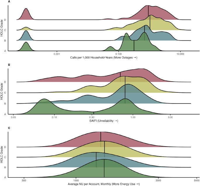
Our analysis of 396 historically HOLC-graded A-D areas with electrical inaccessibility data for 2017-2019 covered 84.8% of the present-day NYC households (Supplementary Fig. S1). We included 386 (97.2%) areas in 311-call analyses, 396 (99.7%) in SAIFI analyses, and 379 (95.5%) in energy use analyses. Most of these areas received a C grade (n = 189 [47.7%]), followed by D grade (n = 119 [30.1%]), B grade (n = 72 [18.2%]) and A grade (n = 16 [4.0%]). HOLC grades varied by borough such that grade D areas were concentrated in Manhattan, the South Bronx, and parts of outer Brooklyn and Queens (Supplementary Fig. S2).
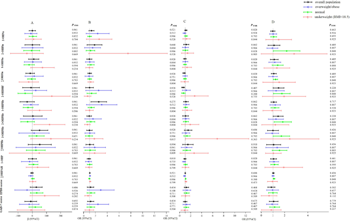
We observed different levels of cumulative outage-related 311 outage calls per 1,000 households by A- versus D-graded areas (p-value < 0.01, Fig. 1A). 311-reported outage rates were most common in C-graded areas (median rate of 1,000 household-years: 1.04; IQR: 0.39-2.27) and D-grades areas (median: 0.92; IQR: 0.37-1.93), where outage reports were three times more common than in A-graded communities (median: 0.31; IQR: 0.17-0.67) (Fig. 1A, Supplementary Table S3). C-graded and D-graded areas with high 311 outage calls per 1,000 households typically occurred in the Bronx, Northern Manhattan, Queens, and Brooklyn (Fig. 2A).
Fig. 1: Ridgeline plot of the prevalence of electricity inaccessibility metrics in New York City, 2017-2019 by historical HOLC grades.
A 311 outage calls per 1000 households, (B) system-related power outages, and (C) electrical energy use. Grade A (green) was “best,” grade B (blue) was “still desirable,” grade C (yellow) was “definitely declining,” and grade D (red) was “hazardous.”.
Fig. 2: Spatial distribution of electricity inaccessibility metrics in New York City, 2017-2019 by historical HOLC grades.
A 311 outage calls per 1,000 households, (B) system-related power outages, and (C) electrical energy use. Areas with a historical grade and the respective electricity inaccessibility metric are shown. Grade A (green) was “best,” grade B (blue) was “still desirable,” grade C (yellow) was “definitely declining,” and grade D (red) was “hazardous.”.
We also found differences in SAIFI by A- versus D-graded areas (p-value = 0.02). B-, C-, and D-graded areas experienced more electrical interruptions than A-graded areas. A-graded areas had a median of 0.33 (IQR: 0.08-0.80) yearly outages per customer, compared to a median of 0.69 (IQR: 0.26-1.34) yearly outages per customer in D-graded areas (Fig. 1B). D-graded areas with high SAIFI were in Queens, and the highest SAIFI metrics were concentrated in C- and D-graded areas in the outer Brooklyn region (Fig. 2B).
Median residential energy use per household did not differ statistically between A- versus D- graded HOLC boundaries (p-value = 0.93) (Fig. 1C). Instead, energy use appeared to pattern by borough rather than HOLC grades. Residences in Manhattan, Queens, the Bronx, and Brooklyn tended to have lower energy use than Staten Island (Fig. 2C).
In our seasonal secondary analysis, 311-reported outages and SAIFI results were consistent with the main analysis. D-graded areas had a greater number of 311-reported outages during the cool season (i.e., October - April) (median: 0.85 call rate, IQR: 0.14-1.66) versus A-graded areas (median: 0.31 call rate, IQR: 0.17-0.48). During the warm season (i.e., May - September), D-graded areas also faced more 311-reported outages (median: 0.95, IQR: 0.33-2.27) versus A-graded areas (median: 0.15, IQR: 0-0.65) (Supplementary Fig. S3). Power interruptions measured by SAIFI were more common in D-graded areas (median: 0.31, IQR: 0.13-0.40) compared to A-graded areas during the cool season (median: 0.20, IQR: 0.06-0.36) and warm season (SAIFI in D-graded area median: 0.35, IQR: 0.12-0.59 versus A-graded area median: 0.13, IQR: 0.02-0.23). In contrast, when considering residential energy use by season, we identified lower warm-season energy use in D-graded areas (median: 1557 average MJ per account, IQR: 1355-1890) compared to A-graded areas (median: 1734 average MJ per account, IQR: 1450-1888).
Present-day ICE census tracts and electricity inaccessibilityOur present-day ICE analyses included 2,218 census tracts containing 3,191,608 households. We included 2,218 (95.3%) census tracts in 311 call analyses, 2,118 (95.3%) in SAIFI analyses, and 2,193 (94.2%) in energy use analyses (Supplementary Fig. S4). Q1 census tracts (most concentrated disadvantage) were located mostly in the Bronx and Brooklyn, while Q4 census tracts (most concentrated privilege) were concentrated in Staten Island and Manhattan (Supplementary Fig. S5).
Rates of 311 outage-related calls differed by Q1 (most disadvantaged) versus Q4 (most privileged) ICE quartiles (p-value < 0.01), with monotonically higher 311 outage calls per 1,000 households at higher levels of concentrated disadvantage. Q1 census tracts had the highest 311 outage calls per 1,000 households (median: 2.20, IQR: 0.83 - 4.01), over five times the Q4 call rate (median: 0.41, IQR: 0 - 0.84) (Fig. 3A; Supplementary Table S4). Census tracts with high concentrated disadvantage and high 311 outage calls per 1,000 households were in the outer Bronx and outer Queens (Fig. 4A, Supplementary Table S4).
Fig. 3: Ridgeline plot of the prevalence of electricity inaccessibility metrics in New York City, 2017-2019 by 2016-2020 census tract level quartiles of racial and economic Index of Concentration at the Extremes.
A 311 outage calls per 1,000 households, (B) system-related power outages, and (C) electrical energy use. Q1 represents quartile with greatest concentration of modern-day disadvantage, and Q4 represents quartile with greatest concentration of modern-day privilege.
Fig. 4: Spatial distribution of electricity inaccessibility metrics in New York City, 2017-2019 by 2016-2020 census tract level quartiles of racial and economic Index of Concentration at the Extremes.
A 311 outage calls per 1,000 households, (B) system-related power outages, and (C) electrical energy use. Census tracts with >30 households were included.
SAIFI distribution slightly differed between Q4 (most privileged) and Q1 (most disadvantaged) census tract ICE quartiles (p-value = 0.02), though Q4 tracts (median: 0.43, IQR: 0.24-0.70) and Q1 tracts (median: 0.45, IQR: 0.25-0.76) experiencing fewer interruptions than Q2 and Q3. In fact, Q2 census tracts had the most interruptions (median: 0.69, IQR: 0.43-1.41) (Fig. 3B). The tracts with the most concentrated disadvantage and frequent electrical interruptions were in the outer Bronx and outer Queens (Fig. 4B).
Energy use in Q4 (most privileged) versus Q1 (most disadvantaged) ICE quartiles differed significantly (p-value < 0.01), with Q1 census tracts having the lowest median energy use throughout the year (median: 1234 monthly MJ per account, IQR: 1147-1358) (Fig. 3C). Areas with both low energy use and high concentrated disadvantage were in outer Brooklyn, the Bronx, and Northern Manhattan (Fig. 4C).
In our seasonal secondary analyses, the results were mostly consistent with the overall findings. During the cool season (i.e., October – November), 311 outage rates were higher among the most disadvantaged census tracts (median = 1.79, IQR: 0.59-3.60) compared to the most privileged tracts (median: 0.28, IQR: 0.00-0.75). During the warm season (i.e., May – September) differences between Q1 (most disadvantaged) and Q4 (most privileged) persisted (median = 2.14, IQR: 0.74-4.56 versus median = 0.34, IQR: 0.00-1.01, respectively) (Supplementary Fig. S6). Power interruptions measured by SAIFI were similar between Q1 (most disadvantaged) (median: 0.15, IQR: 0.12-0.38) and Q4 (most privileged) census tracts (median: 0.16, IQR: 0.08-0.23) during the warm season. However, SAIFI differed between Q1 (median: 0.30, IQR: 0.14-0.57) and Q4 census tracts (median: 0.23, IQR: 0.08-0.36) during the cool season. When considering residential energy use by season, residential households in Q1 census tracts persistently used less energy than households in Q4 census tracts.
In our ungraded HOLC secondary analysis, the 311 outage rate was 0.28 per 1000 household-years in the ungraded boundary, lower than HOLC grades A through D. SAIFI in the ungraded area was 0.90, a higher value than HOLC grades A through D. Finally, the energy use in ungraded HOLC areas was also lower than HOLC grades A through D at a monthly average of 1335 MJ/account.
Relationship between persistent community disadvantage and present-day electricity inaccessibilityWe also considered the potential cumulative implications of an area being persistently disadvantaged, measured by being graded D in the 1930s and Q1 (most disadvantaged) of ICE in 2016-2020. We had data on historical HOLC grades and ICE quartiles for 53.4% of the 783 km2 of land area in NYC. Broadly, we found that historically yellow-lined or redlined areas (HOLC grades C and D) tended to become census tracts with present-day concentrated disadvantages. While areas with historical HOLC grades A and B became census tracts with concentrated privilege (Supplementary Fig. S7). For example, 40.1% (4,965 0.01 km2 gridded square units) of grade D areas became Q1 (most disadvantaged) ICE census tracts, and another 25.3% became Q2 ICE census tracts, whereas only 0.2% (2 square areal units) of grade A areas became Q1 census tracts (Supplementary Table S5). Grade C areas had the most heterogeneity in their present-day ICE quartile corollaries, with 28.9% becoming Q1, 32.2% becoming Q2, 24.9% becoming Q3, and 14.0% becoming Q4 (most privileged). Notably, certain areas with a D-grade became more privileged today, such as the large portions of the Upper East Side that were D-graded but now fall in the Q4 ICE category.
We observed differences in 311 outage calls per 1,000 households and power interruptions when comparing persistently disadvantaged (C or D grade [historical disadvantage] + Q1 or Q2 [present-day disadvantage]) and consistently advantaged (A or B grade [historical privilege] + Q3 or Q4 [present-day privilege]) areas (Supplementary Table S6). Persistently disadvantaged areas had higher median 311 outage calls per 1,000 households versus consistently advantaged areas (1.82 outage calls per 1,000 households, IQR: 0.71-3.42 versus 0.54, IQR: 0.12-1.10; p-value < 0.01). However, the 311 outage rate in persistently disadvantaged areas did not exceed that of present-day Q1 tracts alone. Power interruptions were also more common in persistently disadvantaged versus consistently advantaged areas [average median SAIFI 0.63, (IQR: 0.28-1.34)] versus 0.43, (IQR: 0.24-0.80) (p-value < 0.01)] and the SAIFI in consistently advantaged areas was similar to that in HOLC A areas alone or present-day Q1 ICE tracts. We did not observe statistically significant differences in energy use (Fig. 5). Despite a relationship between redlining and ICE with measures of electricity inaccessibility, our results do not suggest a cumulative effect for areas of persistent disadvantage.
Fig. 5: Ridgeline plot of the consistently advantaged and persistently disadvantaged areas in New York City and their 2017-2019 prevalence.
A 311 outage calls per 1000 households, (B) system-related power outages, and (C) electrical energy use. Consistently advantaged refers to areas historically graded A and presently categorized as economically and racially privileged census tracts (Q4 ICE). Persistently disadvantaged refers to areas historically graded D and presently categorized as economically and racially disadvantaged census tracts (Q1 ICE).
Comments (0)